Writing this blog article, I have opened up SharePoint 2013 preview in another browser window to play around with and understand some of the new UI features. In this series, we'll be looking at the Team Site and in the next, the Publishing site (Site with Enterprise Features turned-on).
Let's look at some of the improvements and changes in 2013 when compared to SharePoint 2010.
Editable Left Nav bar - The Left Nav bar (list of links on the left) are editable in-place now. Click the "Edit Links" button below the left nav and press the "+" button, which then pops up a dialog in which we can enter the title and url for the new link. All the editing's In-place and using a user-friendly modal dialog as show in the images below.

Editable Top Nav Bar - Similarly, the Top Nav bar too is editable in-place with similar UI as shown below-

All efforts have been made to enable the end-user to customize the navigation, in-place, without having to go to the settings page links. It makes the UI much more intuitive and user-friendly.
Document Library View UI Improvements - Now adding or uploading a new document to a document library does not require going to the ribbon buttons, instead, a context sensitive menu pops up on the page itself that has links for creation / upload.

Welcome Control and Site Action Menu changes - In this edition, 'all the action' has moved to the top left so that the user has all the clickable controls within close reach.

Those familiar with 2010 may already know the functionality behind these buttons, so we are just going to look at what's new! Well the coolest thing is the "Focus on Content" button - press this and the Left Nav, Site Icon, Site Title, Top Nav and Search box are hidden or shown (toggle button). When these are hidden, the PlaceHolderMain (Main area) expands to fill all the space below the ribbon. This allows the user to focus more on the content rather than getting distracted by the leftnav, icon and title and it gives more screen space to display content! With this rate, I think, the next version of SharePoint will have minimal.master as default masterpage :-).

All these new features are on just the home page. In the coming days as we'll explore more to find out the
improvements on the inside.
Firstly, the whole UI is modelled on the minimalist Office 2012 UI - flat, neat 'n' clean and with elements of the Windows 8 metro thrown in for good effect. The UI and Functionality are aimed at the typical office worker and have a very informal air about them.
The Team Site - The Office 365 preview of 2013 comes with a default teamsite that looks like this -
 |
| Home page of TeamSite with different elements marked. Those marked with * are new (including the entire Action Menu) |
Let's look at some of the improvements and changes in 2013 when compared to SharePoint 2010.
Hidden Ribbon - One of the changes that increases the screen real estate is the hidden ribbon. In 2010 the ribbon is visible by default and we had to hide it manually. Now the ribbon is hidden by default. To get the ribbon, we have to click the Menu item in the TopLink bar and to hide it just click on the Browse link.
 |
| Ribbon 'on-demand' |
This is a cool feature, as it reduces the page clutter. Notice how the ribbon hides the Site Icon, Title and Search Box when it is visible without pushing them down.
"GettingStarted" WebPart - This is a webpart that diplays Metro style icons that display links to common tasks. On hovering over any icon the translucent overlay slides up to cover the entire icon. Looks like this webpart is not customizable directly.
 |
| The "GettingStarted" WebPart on the Teamsite Home Page |
Editable Left Nav bar - The Left Nav bar (list of links on the left) are editable in-place now. Click the "Edit Links" button below the left nav and press the "+" button, which then pops up a dialog in which we can enter the title and url for the new link. All the editing's In-place and using a user-friendly modal dialog as show in the images below.

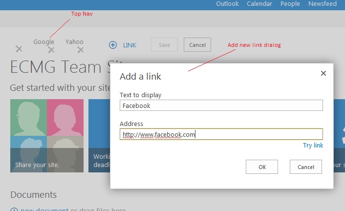
Editable Top Nav Bar - Similarly, the Top Nav bar too is editable in-place with similar UI as shown below-
All efforts have been made to enable the end-user to customize the navigation, in-place, without having to go to the settings page links. It makes the UI much more intuitive and user-friendly.
Document Library View UI Improvements - Now adding or uploading a new document to a document library does not require going to the ribbon buttons, instead, a context sensitive menu pops up on the page itself that has links for creation / upload.

Welcome Control and Site Action Menu changes - In this edition, 'all the action' has moved to the top left so that the user has all the clickable controls within close reach.

Those familiar with 2010 may already know the functionality behind these buttons, so we are just going to look at what's new! Well the coolest thing is the "Focus on Content" button - press this and the Left Nav, Site Icon, Site Title, Top Nav and Search box are hidden or shown (toggle button). When these are hidden, the PlaceHolderMain (Main area) expands to fill all the space below the ribbon. This allows the user to focus more on the content rather than getting distracted by the leftnav, icon and title and it gives more screen space to display content! With this rate, I think, the next version of SharePoint will have minimal.master as default masterpage :-).

All these new features are on just the home page. In the coming days as we'll explore more to find out the
improvements on the inside.


No comments:
Post a Comment